Colour me beautiful - 2026 Interior Colour Trends You Need to Know
If 2025 was the year we dipped our toes into earthy hues, 2026 is the year we dive right into saturated tones. According to the AD PRO Color Trend Report 2025, designers are embracing bolder, more expressive ways of using colors —from colour blocking to decorative wall finishes.
2025 Pantone’s Mocha Mousse and Benjamin Moore’s Cinnamon Slate set the tone (no pun intended) for 2026 where we’ll see neutrals shifting toward rich, nature-inspired shades.
We were pleased to read that colour drenching isn’t going anywhere soon, and remains a favourite of designers globally. And thankfully, feature walls wont be retuning for 2026; not to confuse feature walls with the use of colour to carve space, add architectural edge and unify a complicated spaces.
We’ve looked to Architectural Digest, Living etc., and Pantone to inspire and guide us as to how we’ll be designing and using colour in our own spaces in 2026. See below for our top 5 tips.
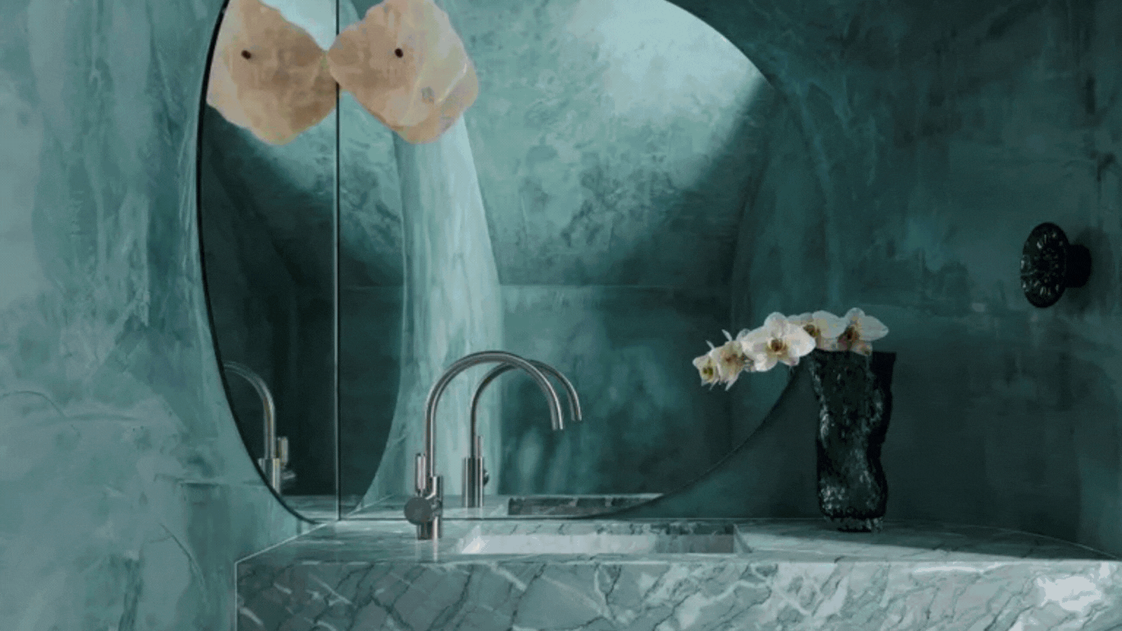
(Image credit: Anson Smart. Design: Smac Studio; Ruth Maria Photography. Design: Roisin Lafferty; Timothy Kaye. Design: SR&O; Bradley Van Der Straeten + French + Tye)
2026 Interior Colour Trends You Need to Know
Here are the key colour directions shaping interiors in 2026—and how to use them in your own home:
1. Colour Blocking for Bold Statements
Designers are using contrasting tones or tone-on-tone layering to define zones and add architectural impact.
 💡 Pro Tip: Use colour blocking to visually separate an open-plan living space—like painting a dining nook a rich terracotta while keeping the lounge in a softer olive.
2. Earthy, Expressive Shades
From deep olive and oxblood to burnt orange and plum, earthy colours are leading the charge. These hues bring warmth, sophistication, and a connection to nature.
 💡 Pro Tip: Try Benjamin Moore’s Cinnamon Slate on trims or cabinetry to ground a room without overwhelming it.
3. Decorative Painting & Murals
Hand-painted murals and textured walls are making a comeback as people move away from plain neutrals.
 💡 Pro Tip: Even a small detail—like a painted arch over a doorway—can give your home an artisanal, design-forward edge.
4. The New Neutrals
2026’s neutrals aren’t white or grey—they’re sage greens, warm browns, muted pinks, and soft blues. These tones provide calm backdrops without feeling cold or dated.
 💡 Pro Tip: Pair Pantone’s Mocha Mousse with sage green upholstery for a luxurious yet grounded effect.
5. Colours to Avoid in 2026
Designers agree: it’s time to leave behind cool whites, flat greys, pastels, and neon brights. They feel too sterile, outdated, or overwhelming in today’s warmer, more natural palettes.Ready to Create Your 2026 Colour Story?
Colour should make your home feel like you. Whether you’re dreaming of a terracotta-and-sage living room, a moody olive dining space, or a warm, brown-toned bedroom, we’ll help you find the right palette with confidence.👉 [Book your Colour Me Beautiful consultation today] and bring 2026’s colour trends home—beautifully.